I not sure what to write here. Not because I didn't learn anything, but because I think that the most important things will come out later in our careers. Or maybe next week, but sometime in the future. A month is a short time to pick up as much Dr.R was laying down but I think what I did Manage to get will be very useful.
I learned a lot about lighting techniques and what goes into the planning of a lighting design. A good deal was said about cameras and lenses and filters. A few editing techniques were discussed. Overall preparedness was stressed.
I think that this class was most fun class I've taken in quite a while and should be mandatory for majors.
Equally I felt that this was one of the hardest classes I have taken. And oh so compact. This class hurt. But enjoyed every minute of it.
Viewer Discretion Advised
Friday, August 3, 2012
Thursday, August 2, 2012
Reel & Artist statement
Artist Statement, huh? I think that art should have reason Well I guess my reason is to entertain people. Wether it's comedy or documentary, or acton. I want tell stories about the relentlessness of the human sprit. I want People to have a connection to that they are seeing on screen. That is the most important part.
What is a story? What is a Good Story? What is a story with no one to listen? No matter how good the narrative, if the execution is off, it greatly effects the ability to capture a relationship with the audience. But just as possible, if the visuals are perfect and the editing is as good as it can get, it won't matter if the story is useless.
In the end it is the intertwining of vision, narrative and technique that matter when trying to tell a good story. That is what I am trying to do.
Wednesday, August 1, 2012
Tuesday, July 24, 2012
Wednesday, July 18, 2012
Lighting
This picture is very interesting. I like the use to of the
soft light to illuminate the front of the car and the unnatural green glow
coming from inside the car. I feel this give a nice contrast to separate the
very nice sky background.
This picture has a very nice contrast of light between the
ground and the sky. The shafts of light that are captured give an ominous feel
to the picture as a whole. The picture has on overall cool color palate but has
some warmer elements in the clouds in the distance.
I really love the lighting in the picture because of the
unnatural feel it gives to it. This picture has a very strong key light and has
a natural backlight that gives a very nice separation of the subject from the
background.
This picture is very cool because of the overexposed
background that gives it an almost mystic feel. The left and right side of the
frame have a large amount of contrast with each other, and the color palate is
very warm.
This photo has a very cool palate with the mist rising form
the field. I like the contrast between the dark foreground and the bright sun
and background.
I really like the earth tones used in this photo. The shadow
vs. light dynamic is very breathtaking as well. The red gives a nice contrast
to the green foliage.
Tuesday, July 17, 2012
Movement
Boondock Saints - Hotel scene
This is a great scene form the cult classic The Boondock Saints that has several slow-mo dolly shots.
These are two frames from a dolly shot towards the beginning of The Departed
Dolly an jib shots are good when used to track something in the scene or reveal something in a slow dramatic way. When they are over used however they lose their dramatic value and become repetitive.
Monday, July 16, 2012
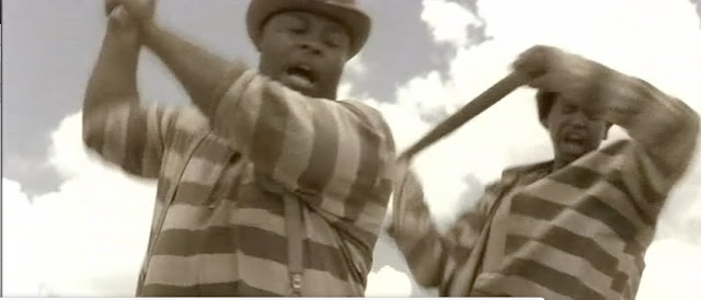
Opening to O’Brother Where Art Thou?
O’Brother Where Art Thou?
Director: Joel Coen
Cinematographer: Roger Deakins
O’Brother where art thou? Starts off with an extreme wide
shot of an open field. The distant tree line and sky that takes up over
two-thirds of the frame represents the isolation and longing for freedom felt
by the characters. The completely desaturated color gives a since of age to the
film.
This shot is a downward facing dolly shot going down the
line in-between the prisoners. The chains are framed on both lines of the left
and right thirds. This shot clearly represents the depression felt by the
prisoners by showing the physical chains that bind them. This also shows how
the prisoners are bound to one another.
This shot is
farmed low on the near talent and has a wide depth of field. In the left of the
frame is the almost smiling face of a prisoner, and in the right of the frame
is the stern face of a guard. This shot shows the conflicting attitudes of the
two sides of opposing characters that is reveled throughout movie.
This shot is almost a reverse shot of the opening shot. Although
in this shot the camera is more of a tracking dolly shot in which the guard on
horseback rides through, the guard’s gun is highly visible in the shot once
again. The vanishing point illusion is once again used. This shot reiterates
the dominance and seriousness of the guards.
Subscribe to:
Comments (Atom)


